MERRITHEW® BRAND OVERHAUL
The Challenge
Merrithew® had built a loyal global following over decades - but by the mid 2020s, its visual identity hadn't been meaningfully updated in over 25 years. The refresh needed to go beyond aesthetics: the brand also required a full architectural overhaul, reorganizing into four distinct sub-brands while absorbing several acquisitions. The challenge was building a cohesive, scalable system that could house multiple identities without losing clarity or authority.
The Solution
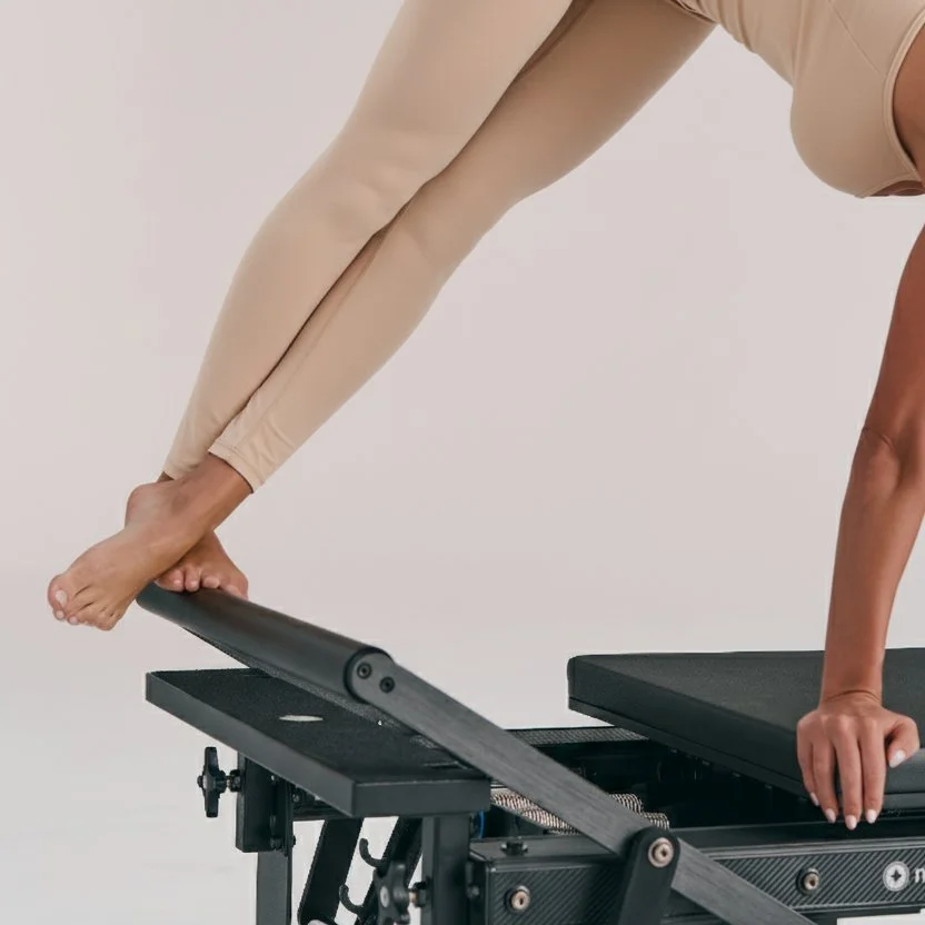
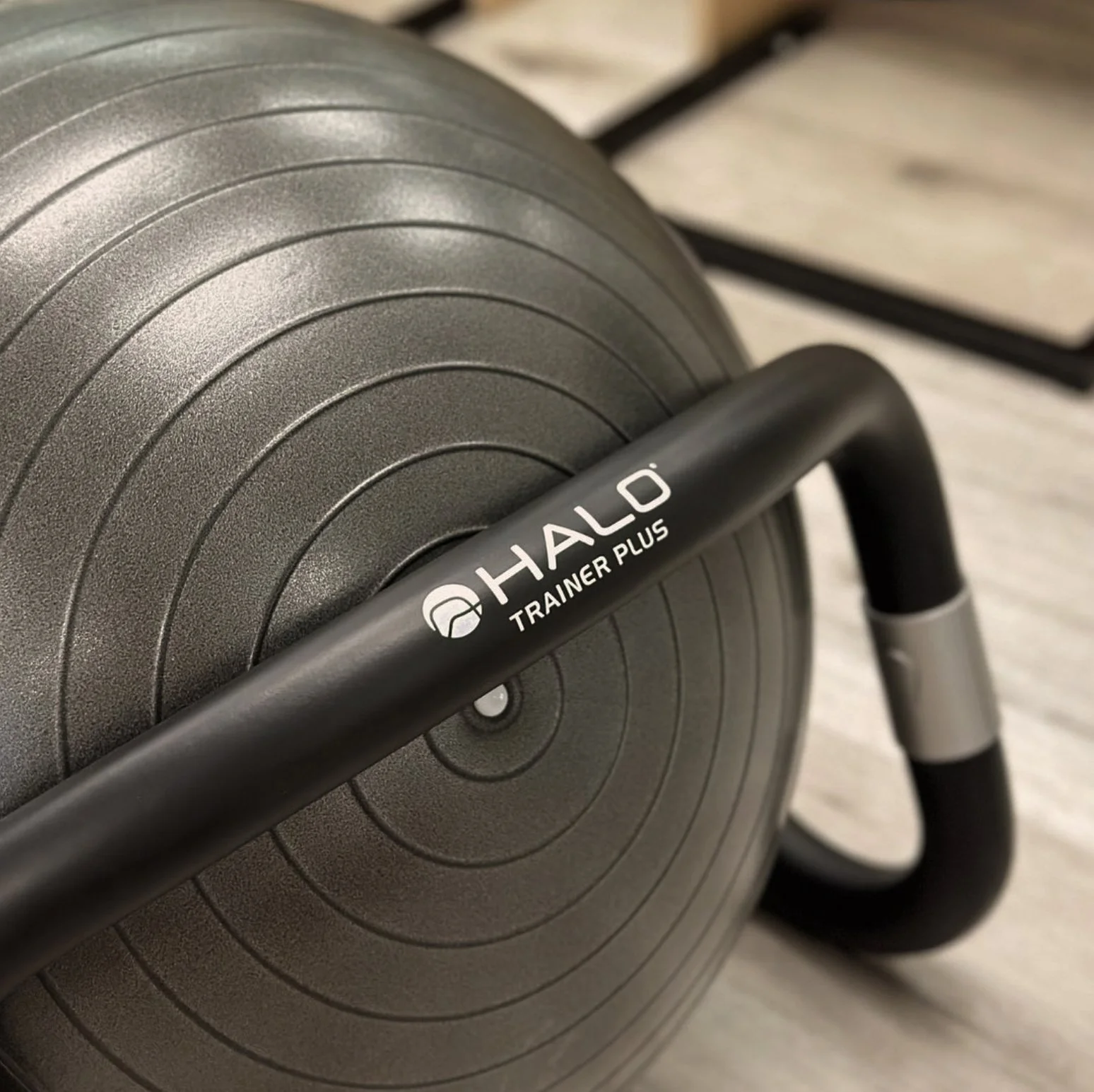
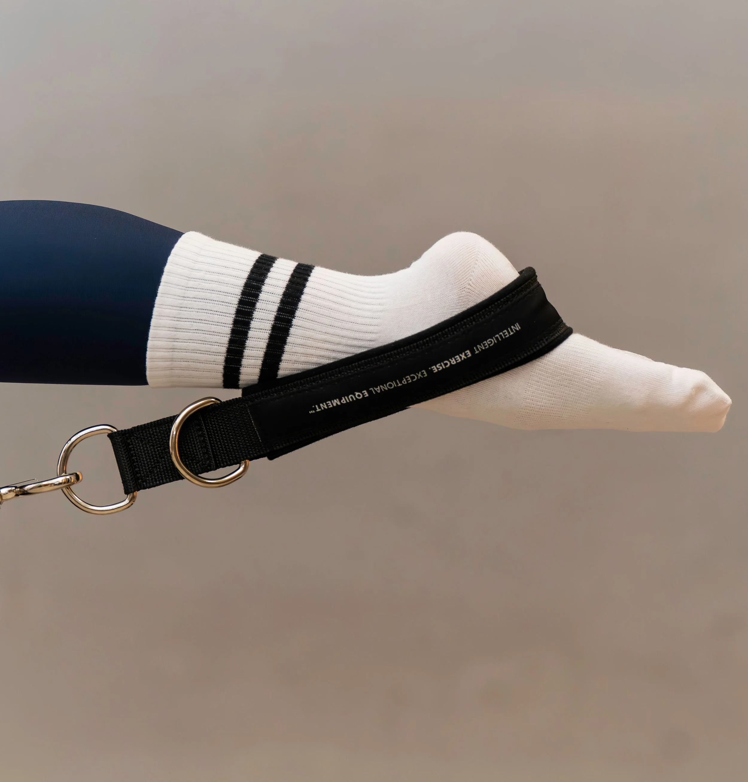
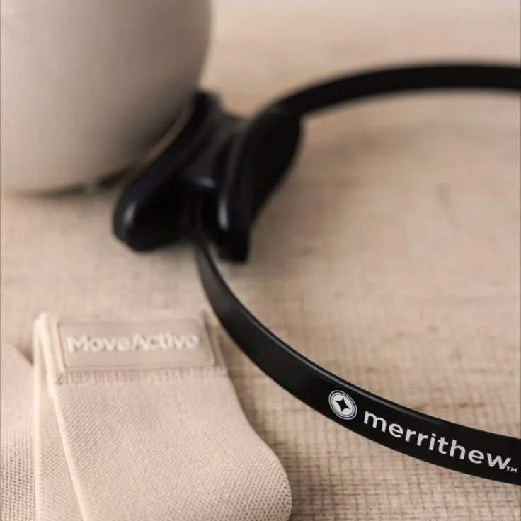
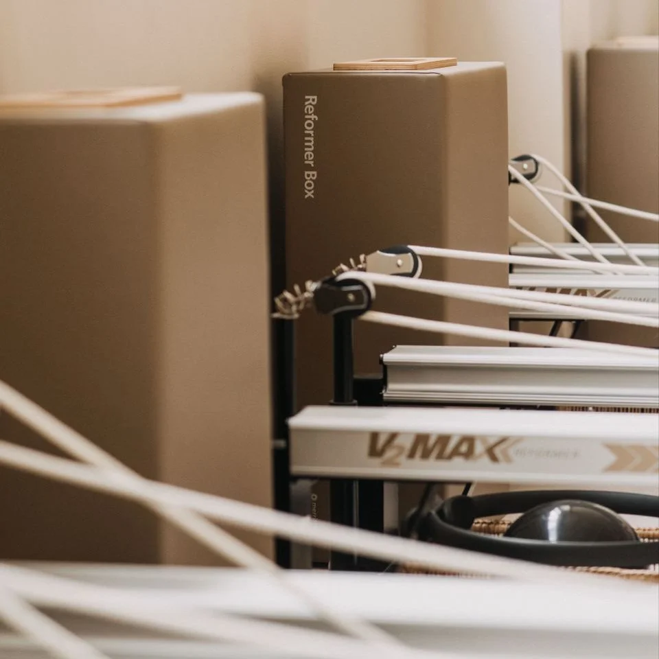
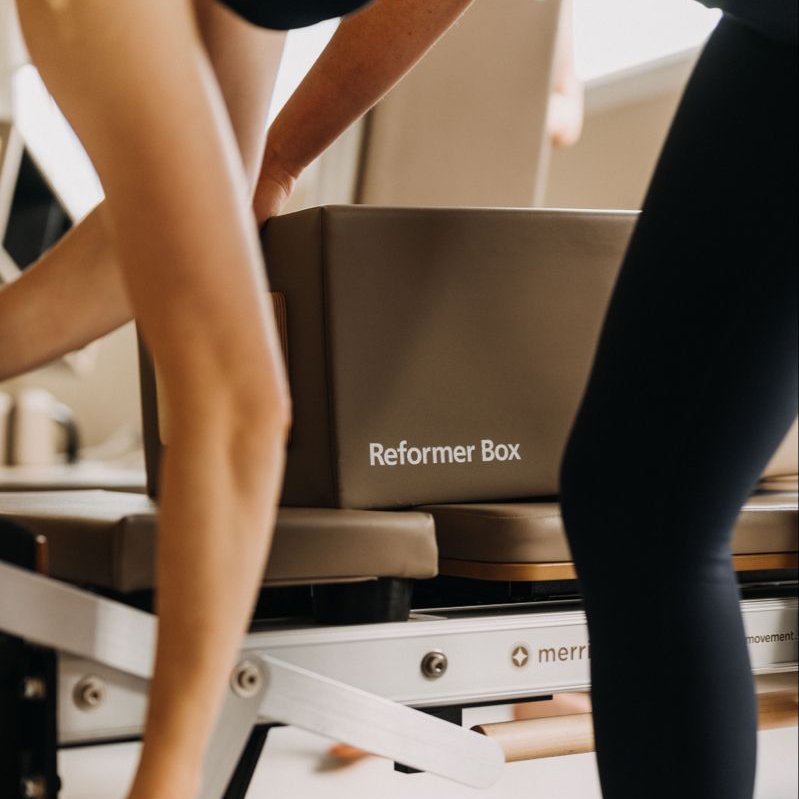
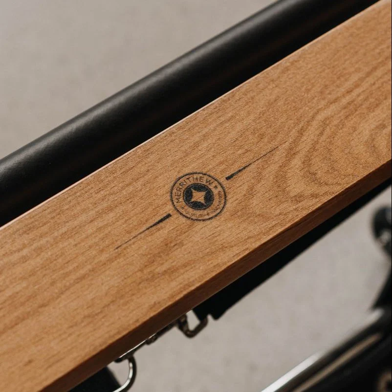
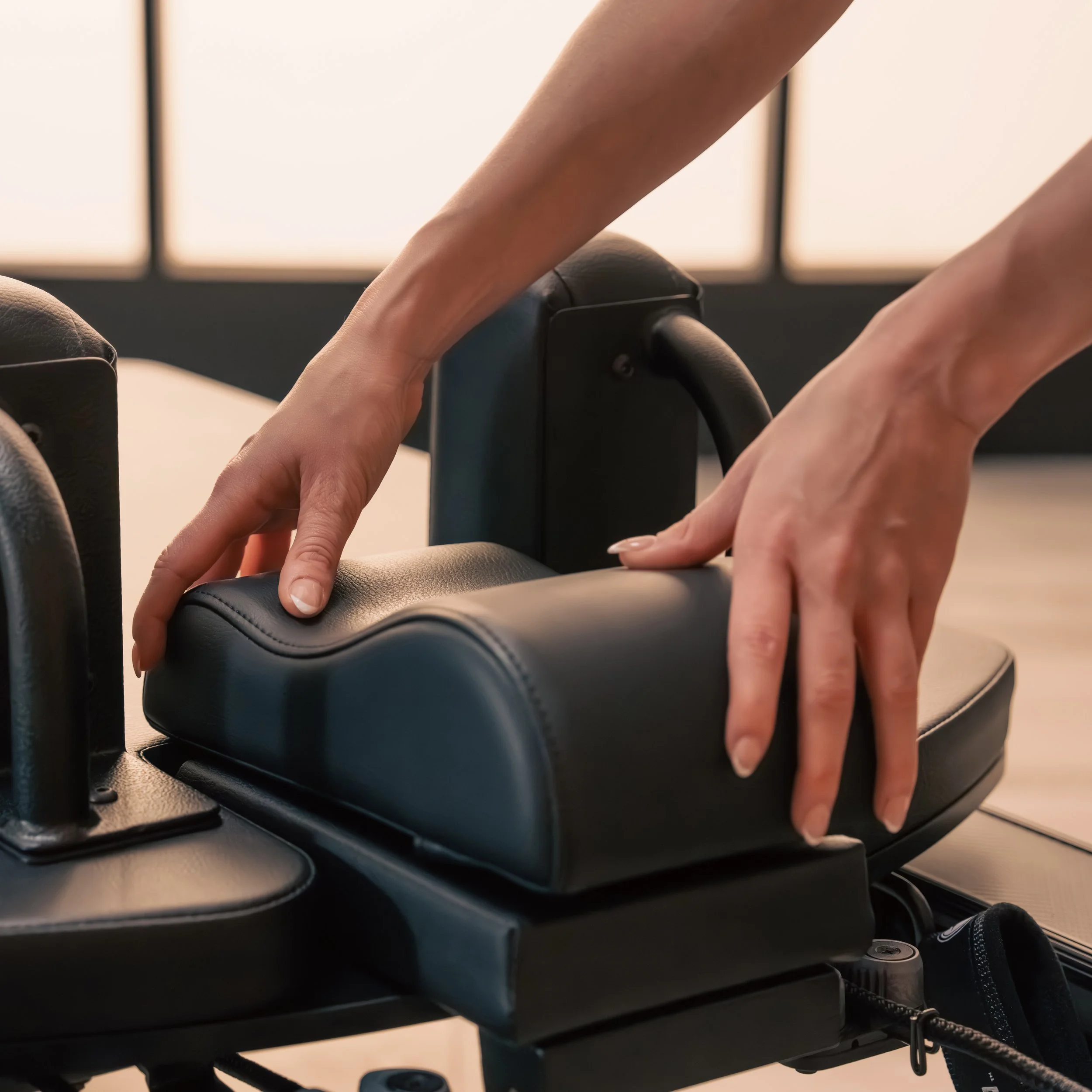
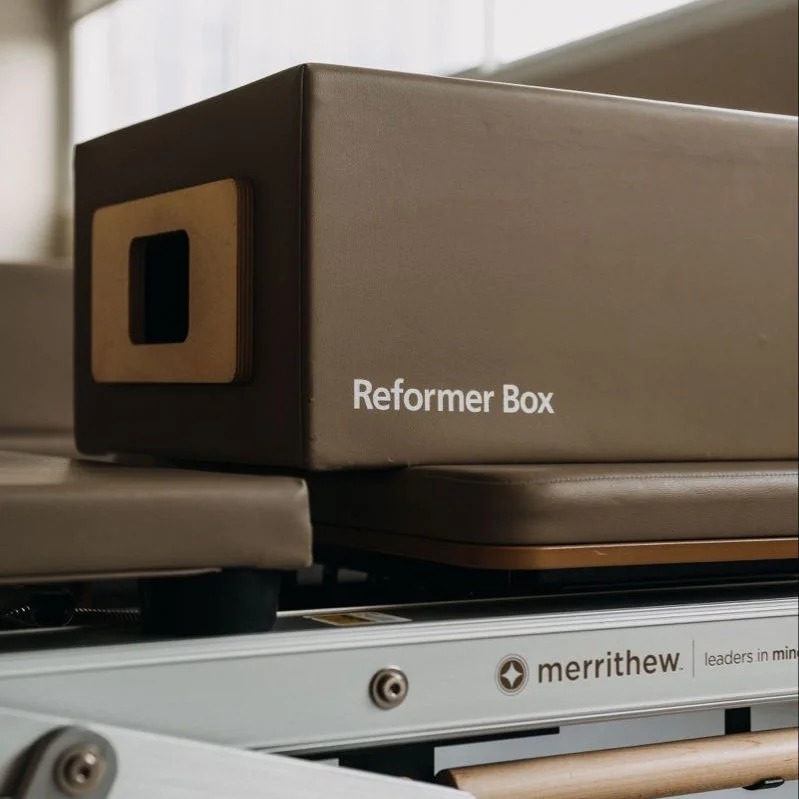
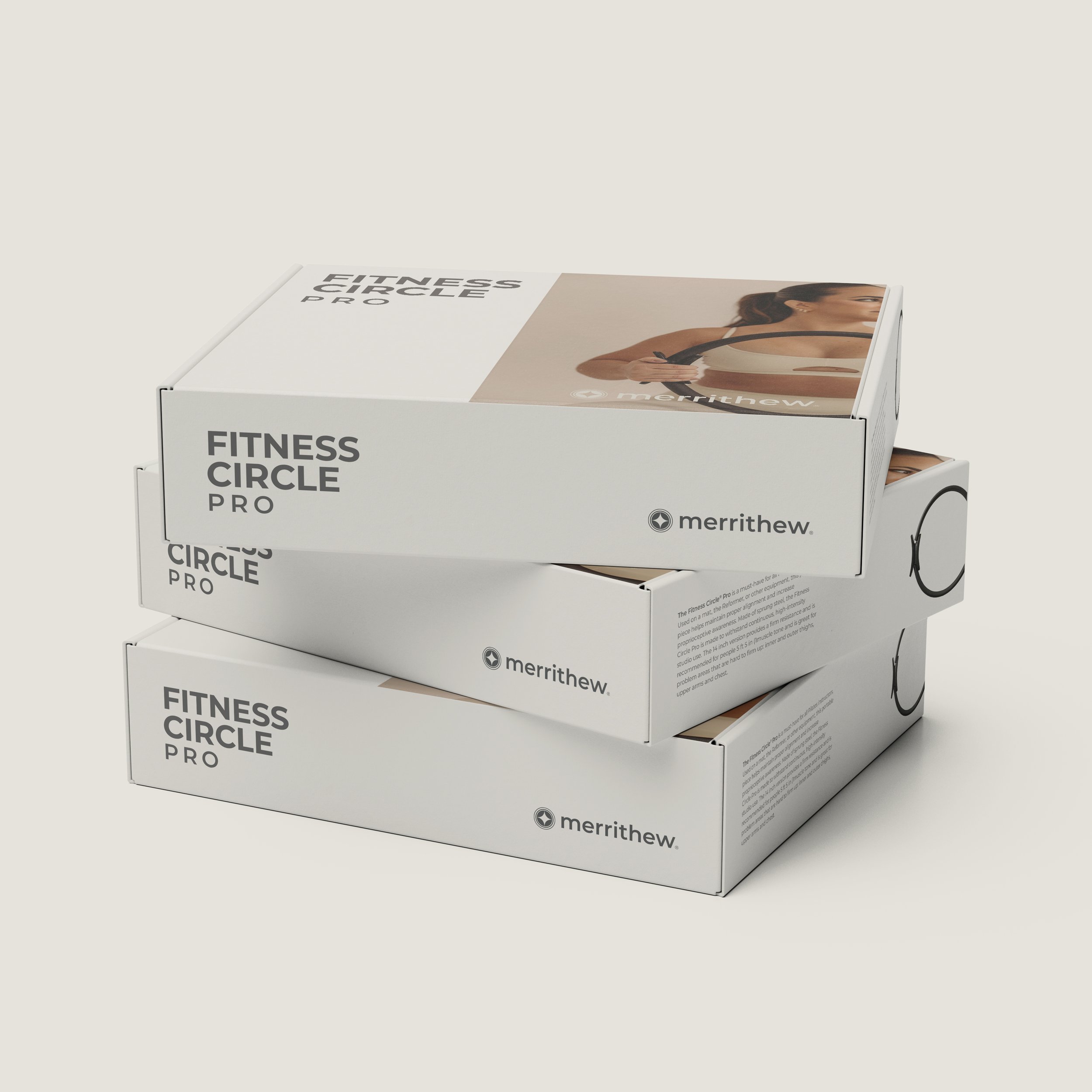
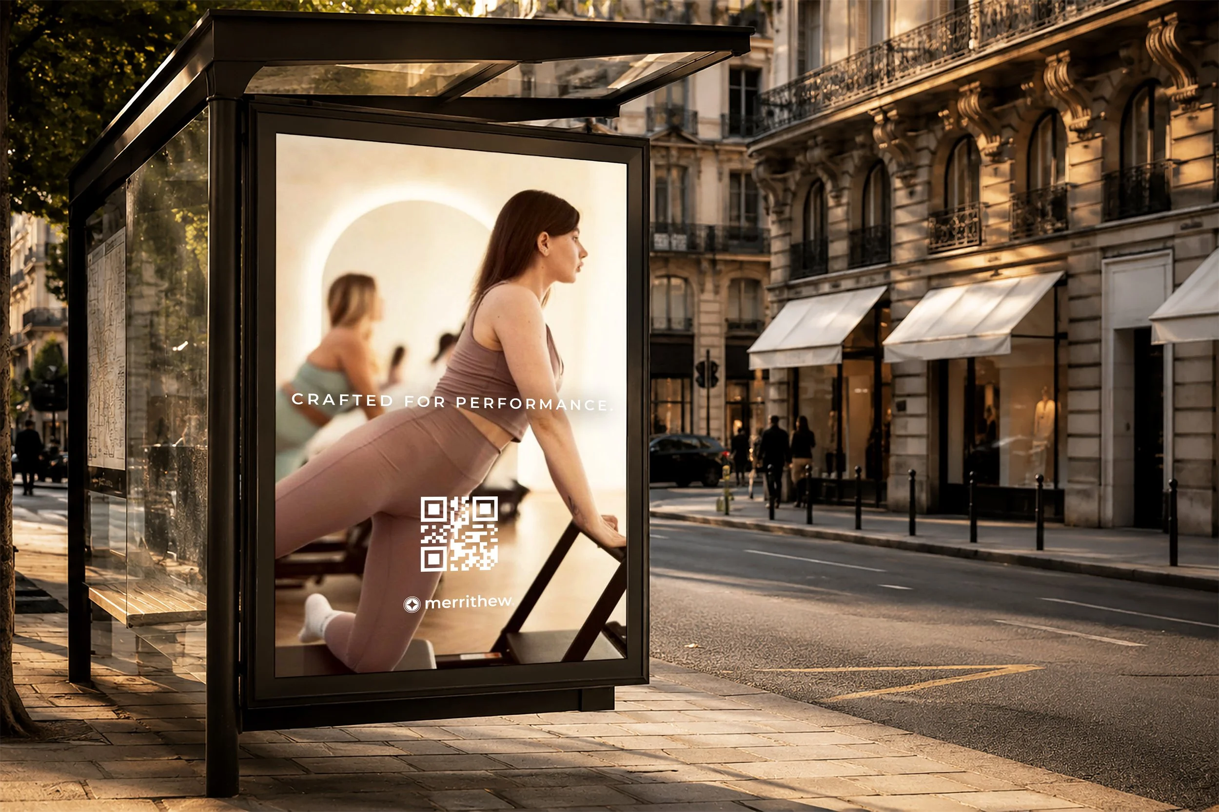
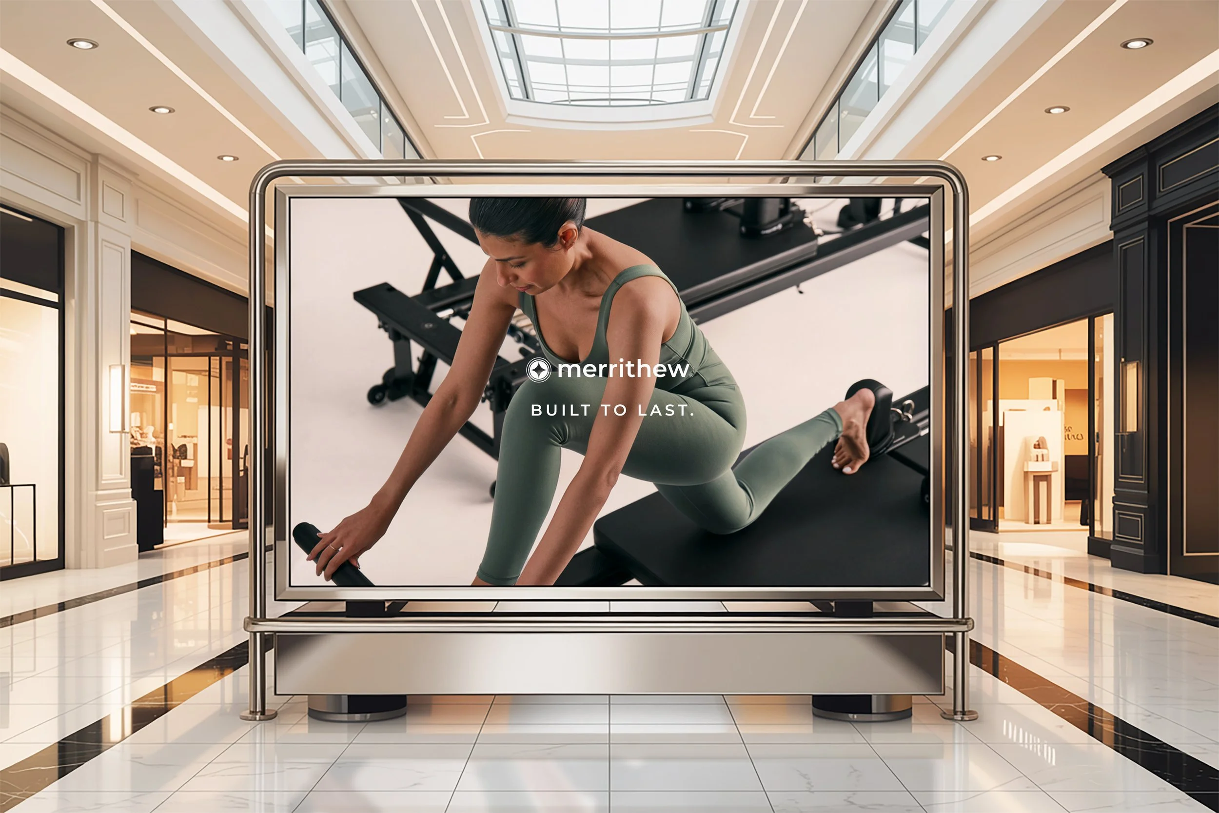
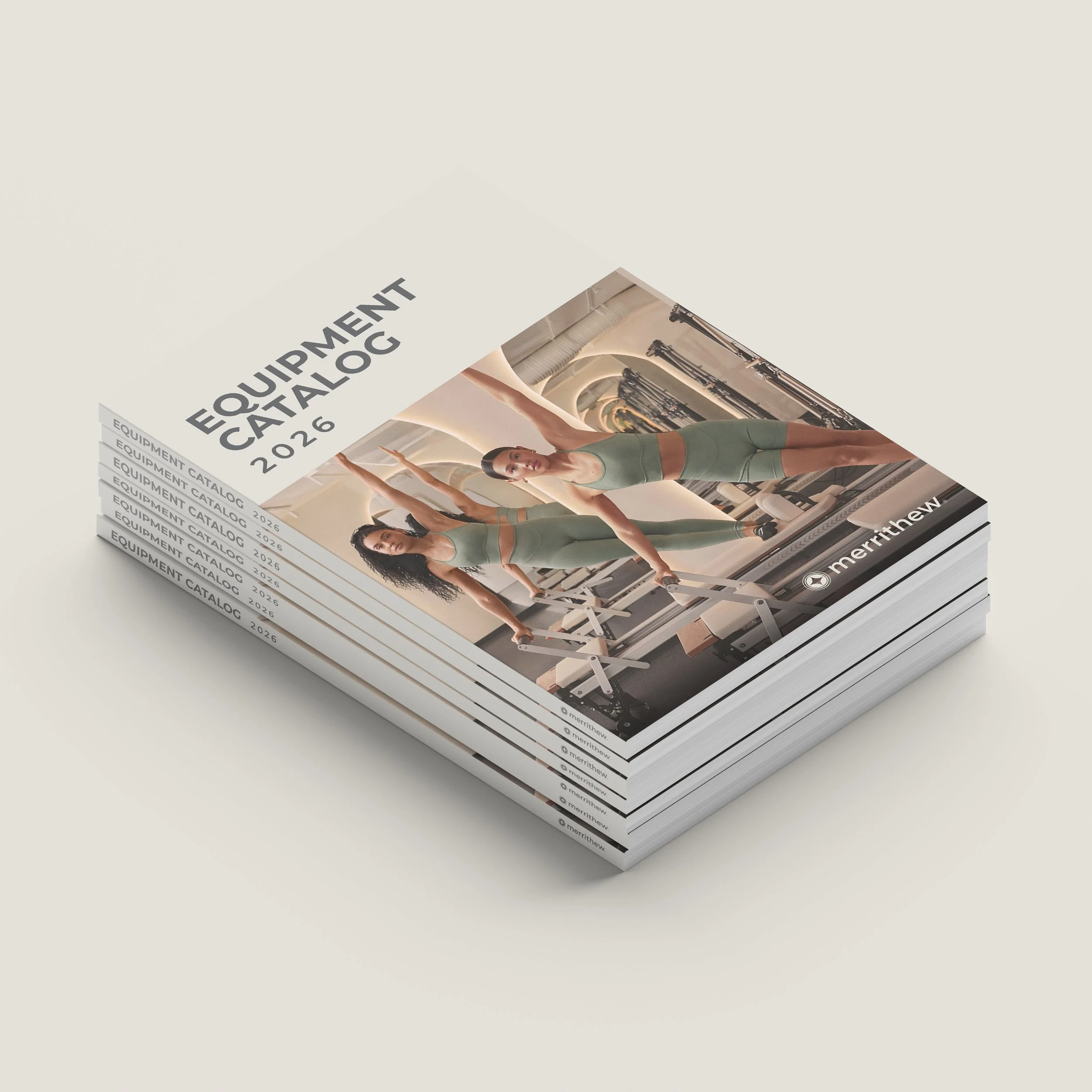
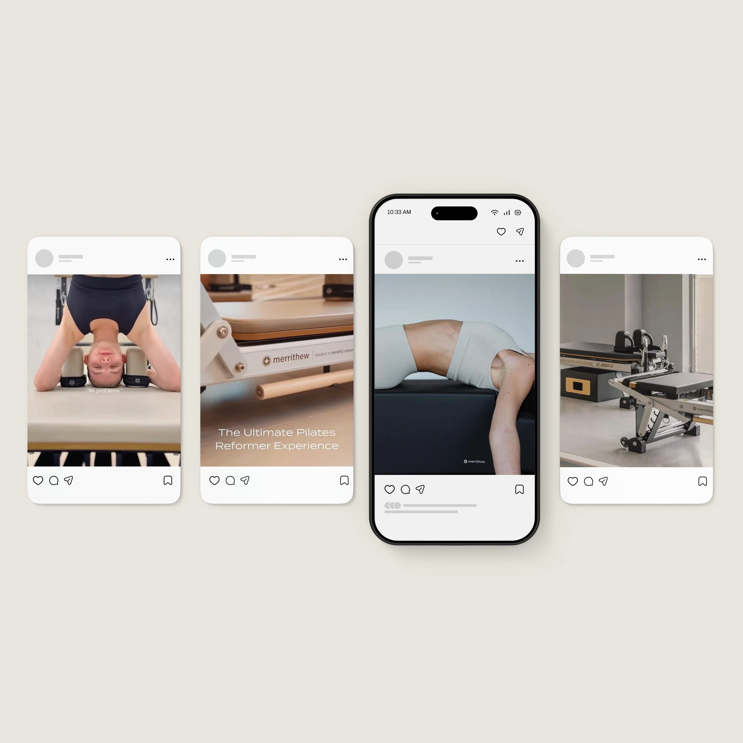
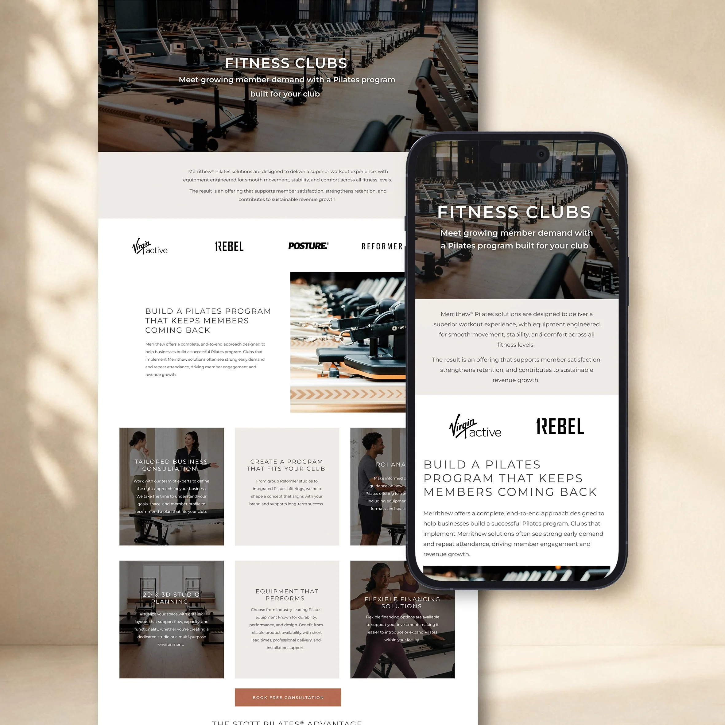
I led a 360-degree overhaul touching every layer of the Merrithew® identity - colour, typography, logo, equipment and packaging, and a fully redefined photography and video direction - turning Merrithew® into a modern lifestyle brand.
Refreshed logo and updated colour system across all brand tiers
New typography suite across digital and print
Redefined photography and video style guidelines
Brand architecture across four sub-brands
Integration of acquired brands into the Merrithew® ecosystem
Global rollout to partners, distributors, and resellers worldwide
The Experience
The impact was measurable across every channel - social following, viewership, website traffic, and time on site all saw meaningful lifts. Most significantly, consumer perception shifted in a deeply positive direction. What had once felt dated now felt like a category leader.
Client: Merrithew® International
Role: Creative Director, Design & Marketing
Brand Book
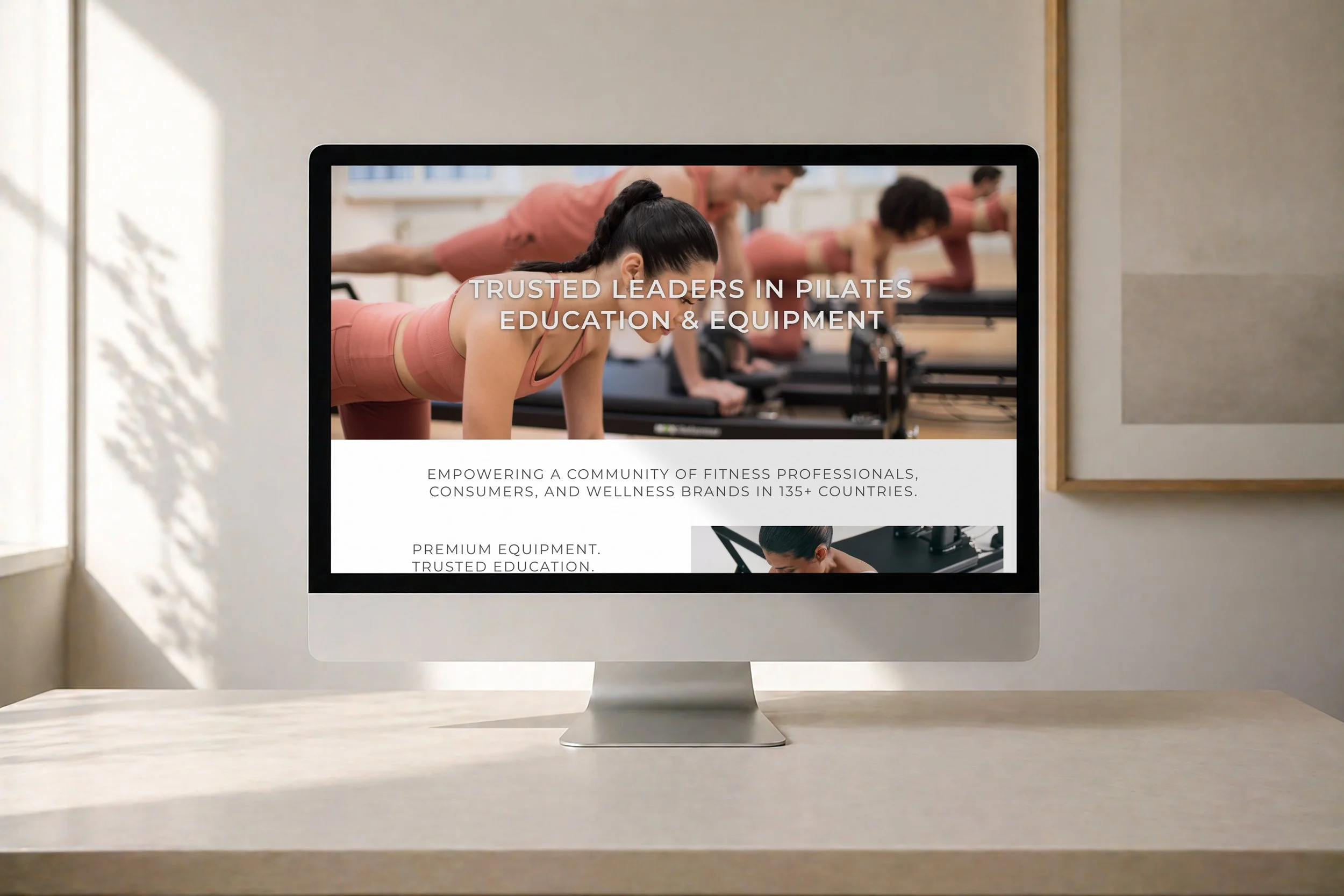
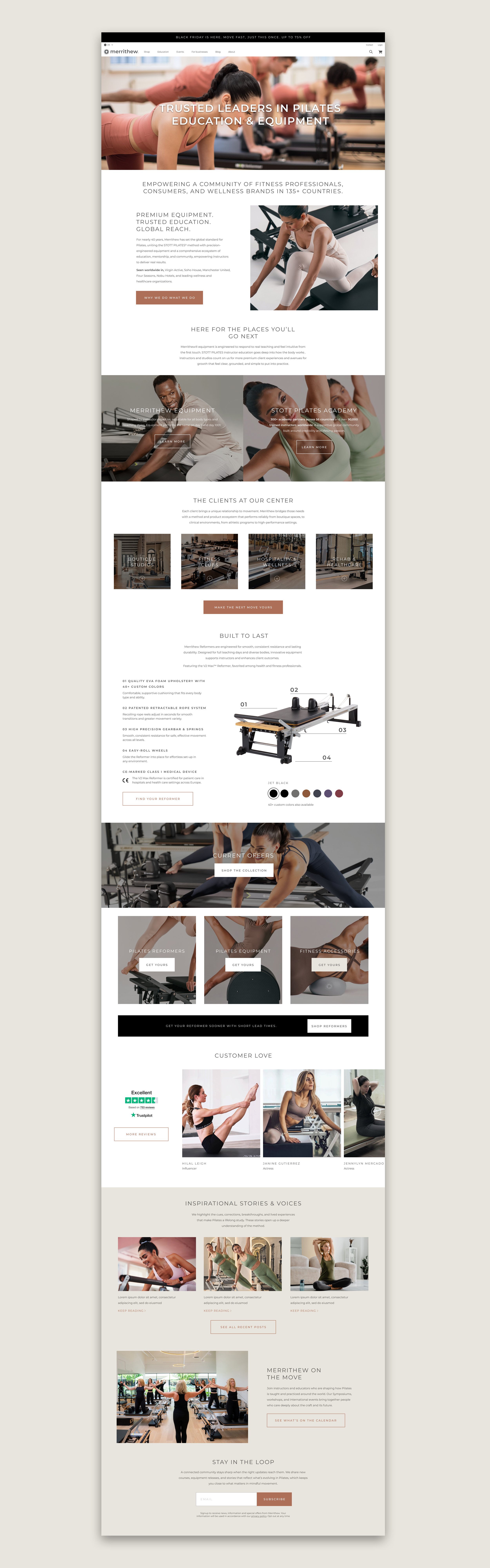
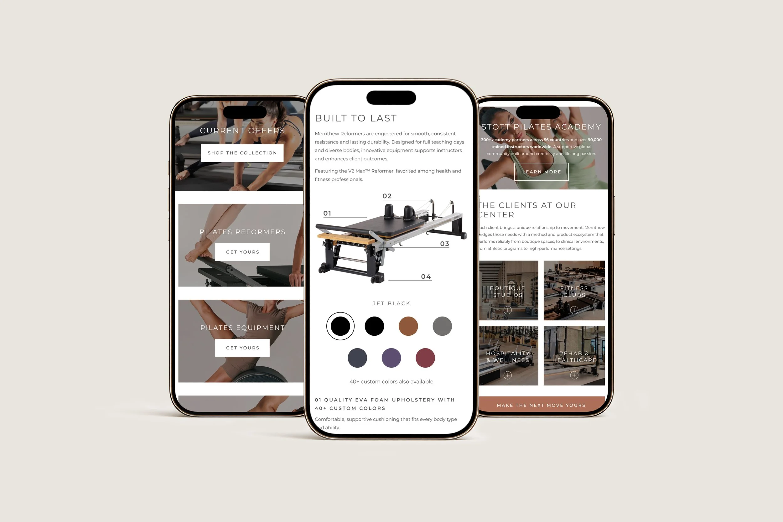
Website Redesign
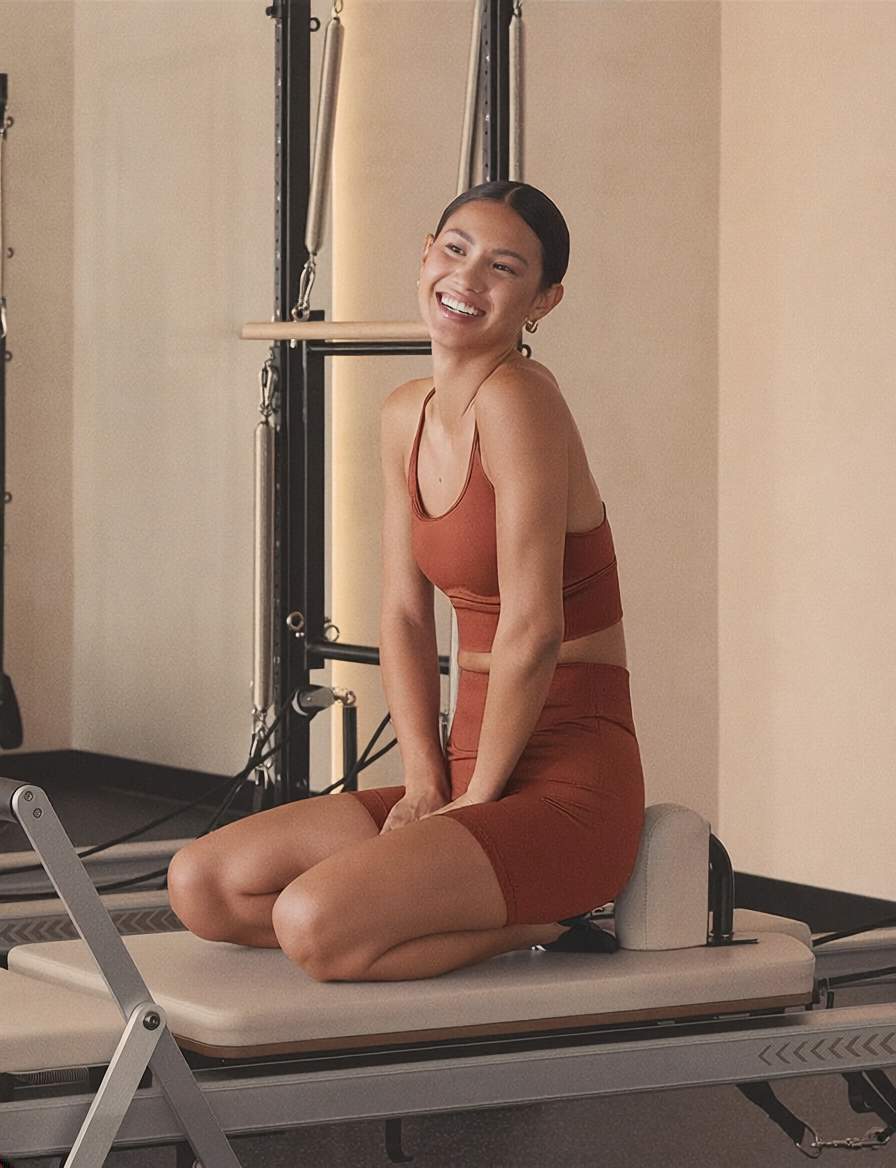
Lifestyle Photography


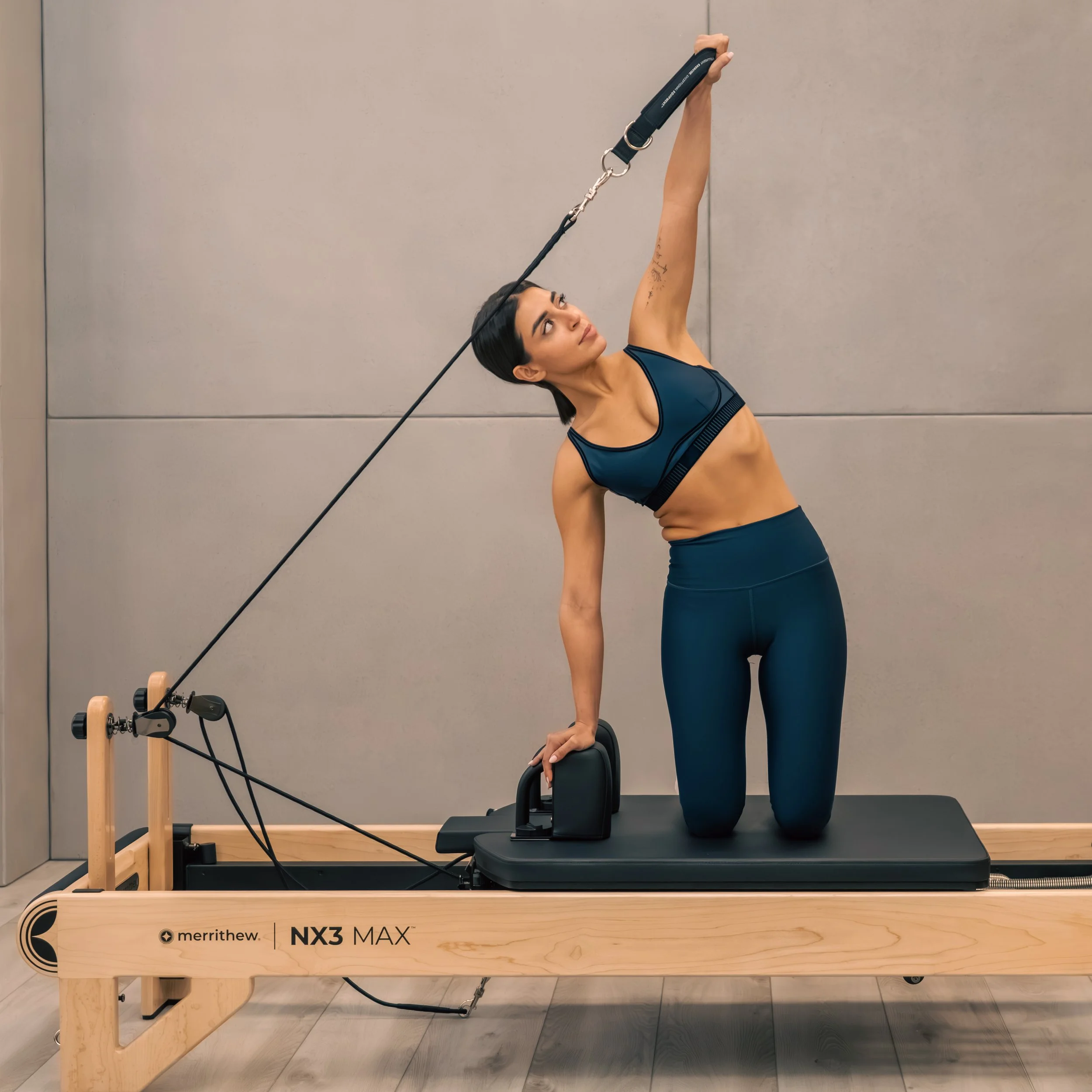
Product Photography